Renovating your kitchen, living room, or designing the interior spaces of your new house, and not sure which colours to opt for? It’s not all about neutral colours anymore. With 2017 bringing back to the frontier earthly hues, tropical greens, and elegant camel accents, and 2018 embracing an even edgier palette of colours, including fiery reds, and metallics, the world of design is seeing colourists reclaiming the limelight.
A keen desire for personalisation and self-expression is driving the interiors of new homeowners, and in 2018, industrial, product and interior designers embracing unexpected shades – below you will find 8 of them.
These are eight of the colours that are taking over the world of design in 2018, and which are expected to keep influencing the direction of fashion and interior design choices in 2019 and beyond.
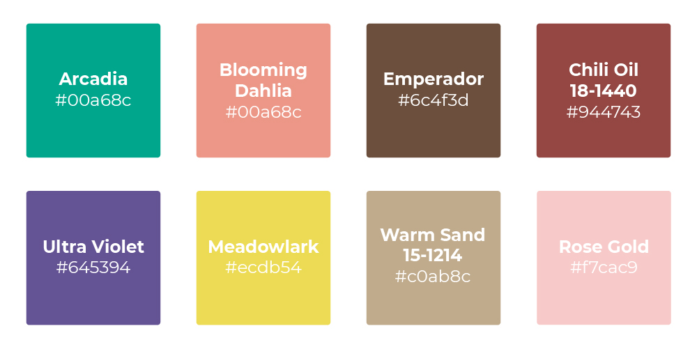
Arcadia
RGB 0 166 140 HEX/HTML #00A68C
Arcadia reminds you of the bright bluish-green encrustation or patina formed on copper or brass by atmospheric oxidation. This vibrant green with subtle blue undertones is perfect for those who want a rich option to pair with subdued neutrals such as rose gold or to complement warm colours such as dark red (#850f26).
Blooming Dahlia
RGB 235 150 135 HEX/HTML EC9787
Blooming Dahlia depletes the vibrant orange in Cherry Tomato (#c62b27), to attain a soft shade of red that bears great resemblance to some of all-time favourite colours – such as dark salmon and coral reef.
Rose Gold
RGB 247 202 201 HEX/HTML #F7CAC9
Its popularity started rising back in 2015 when the rose gold iPhone caused the colour to “hit critical mass” in the market. In 2016 the colour was named Pantone Colour of the Year, under the moniker “rose quartz”. When considering pink’s lasting association with femininity, its continuing success as a colour amongst both men and women in both interiors and fashion is a positive comment on our changing perception of gender connotations. Perhaps, it is because it evokes so many feelings that everyone can relate to, making for the perfect mood-enhancing paint colour.
N.B: Quartz is actually colourless – it is the other minerals that get added in that give them different colours. The impurities that give quartz a haute-couture-worthy pinkish hue is titanium.
Ultra Violet
RGB 100, 83, 148/HEX #645394
For 2018, Pantone named Ultra Violet the colour of the year. Purple has been associated with royalty, wealth, complexity, craftsmanship, ecclesiastical power, and counterculturalism. Purple underscores originality and ingenuity, complements well with yellows and greys, and pairs especially beautifully with last year’s reigning colours, namely greens and vegetal colours like Celery.
N.B: Purple has a tendency to become popular around important turning points in history, particularly times of social turmoil that act as crucibles for artistic expression. Purple was a favorite color of the Fauvists in the revolutionary first decade of the twentieth century, and had a heyday with musical artists like Jimi Hendrix in the late 60s and early 70s, at the apex of the Countercultural movement.
Meadowlark
RGB 236, 219, 83 / HEX #ECBD54
The bold and lively Meadowlark, a confident and outgoing bright yellow shade, has become the go-to colour to direct attention and complement colours we’ve mentioned above. If you’re going to paint a wall or add a yellow ornament at home or in a window display, you know yellow is going to draw the eye. A growing popular choice to compliment Meadowlark and other yellows are rich blues, such as Sailor Blue.
N.B: Another shade of yellow that is becoming especially popular is Citrus (#9fb70a).
Emperador
RGB 108, 79, 60 | HEX #6C4F3D
The rich chocolate infused brown Emperador is one of the more unexpected colours to make it in 2018’s list. Along with the global shift towards earthy colours, Pantone Colour Institute executive director Leatrice Eiseman cites influential show Game of Thrones as a driving force behind the addition of this colour, which is becoming a popular choice for accents and fabrics in interiors.
Chili Oil 18-1440
RGB 147, 71, 66; HEX #944743
Seasoned yet season-less, this colour’s name takes after the crushed red pepper condiment famous in Sichuan cuisine. This surprising colour is an earthy brown based red that adds flavour and is a great colour for that part of the room that you really want to make shine.
Warm Sand
RGB 192, 171, 140 / HEX #C0AB8C
Just like the warmth of sand between your toes on a sunkissed beach, this colour combo creates an effortless and easy vibe. This is a comforting neutral shade that effortlessly connects bolder colours together, pairing seamlessly with vivid greens. Alternatively, for a more classic feel, it pairs well with ivory white or coconut milk.


